Match Page Redesign
- Product design
- UI / UX
- Data-driven
- Web design
- Solo
The match page is where Varzesh3’s users go to follow a game: scores, stats, lineups and events.
I redesigned how this information is organized and presented, starting from what users told us they struggled with and what they actually wanted to see during a match.
- Client
- Varzesh3.com
- Industry
- Entertainment & media
- Year
- 2025
- Duration
- 7 Weeks
- Role
- Solo Product Designer
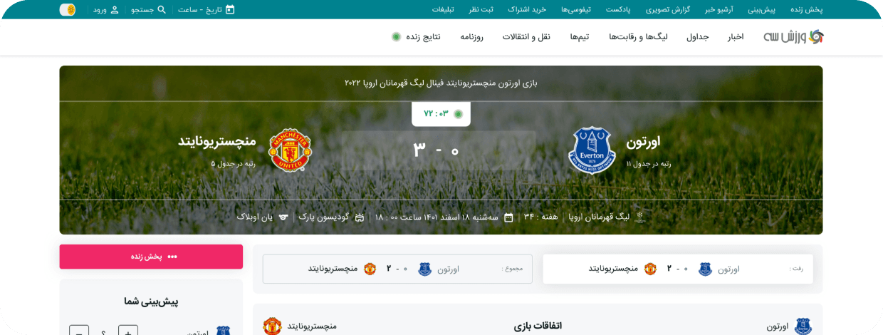
The project
This project was a redesign of the match page on Varzesh3.com, with the aim of increasing engagement on inner pages and growing overall page views. The new page brings together comprehensive game information, including player details, game statistics, and the upcoming and past matches of both teams. It was designed as a flexible template that supports all of the site’s main sports, including football, volleyball, basketball and beach soccer, so each sport can show the information that matters most to its fans within one consistent structure.
My role
As the sole designer, I took the project from research to handoff. I conducted the user research, created the wireframes and designed the final UI. I then handed the designs over to the developers and worked closely with the tech team, discussing technical limitations and finding solutions that kept the design intact.
The Problem
Most of Varzesh3’s traffic lands on the homepage, which gathers a lot of information about games in one place. The match page, by comparison, offered very little. Users would open it only to check the event details, such as the time and the result, and leave soon after. Inner pages like this one had too little to offer to keep people on the site, which also limited our potential to rank higher on Google.
The Goal
- Give users all the stats and game information they need on a single page, so they don’t have to look elsewhere.
- Track the page through two metrics. Page views show how well the design guides users to this page, and page duration shows how well it holds their attention.
- Create one template that works across the most important and most viewed sports, so the page can grow with the site.
- Add richer content to each match page so it can rank better on Google for matches, teams and players.
- Turn a quick check of the score into a habit by linking to past and upcoming matches, so fans keep following their teams on the site.
What I did
Gathering data & limits
I started by collecting everything I needed to design with confidence: Clarity recordings to see how users actually behaved on the page, categorized user comments to learn what they were missing, the technical and stats limits of what we could build, and a competitor analysis to see how other sites present match information.
User needs
- Live league table
- Next game for each team
- Ongoing games of the week
- Predicted lineup
- Players score in the game
- Game starting notification
- Top Player stats
- Prediction the result of the game in this page
Competitive benchmarking
- Injuries and Suspensions
- Best player stats
- Last head to head stats
- Season so far
- Insights of teams
- Form guide style
- Final stats style
- Best player of the game
- Information Architecture
Technical limitations
- We had push notifications, but they could not send real-time game start alerts.
- We relied on third-party data from a website, but the dataset was insufficient for our needs.
- A key technical challenge was managing our server storage, as we couldn’t indefinitely archive all game statistics and historical data.